2022 Color Trends for Interior Design
publicat in: General // Publicata pe 19.03.2025
Back in 2020, Classic Blue was announced by Pantene as the new color of the year. Then, for 2021 Pantene introduced two colors: Illuminating and Ultimate Grey. Finally, the 2022 Pantone’s Color of the Year is Very Peri. Even though you probably already knew it, we are going to explain here the symbolism of this color and its relevance for your home decoration project.
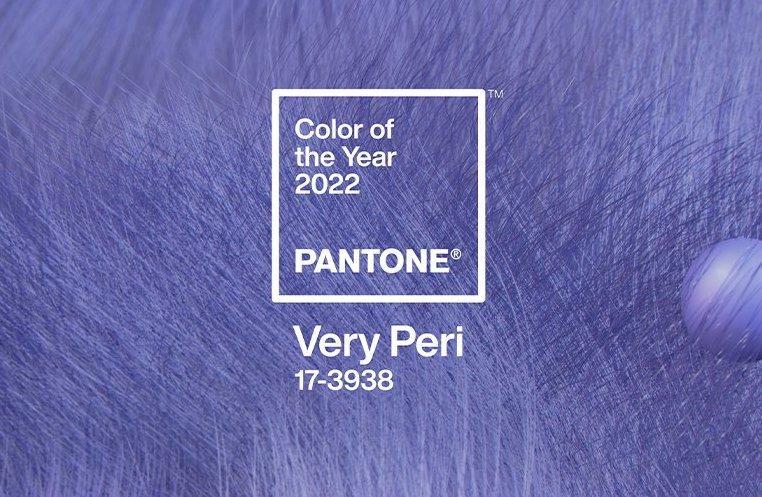
Very Peri is Color of the Year 2022, photo source: romaniatv.ro
Since 2000, every December, the Pantone Institute chooses a relevant color for the upcoming year. Very Peri is 2022 Color of the Year, aiming at placing the future in a fresh perspective - the carefree confidence, the daring curiosity that animates the creative minds. It helps society accept the status quo, open up to new opportunities as things change, and promotes the concept of the metaverse.
The 2022 Color: The Symbols of Very Peri
In line with the description, Very Peri is a dynamic shade of periwinkle blue with a violet red undertone that aims to combine the loyalty of blue with the energy conveyed by red. This is "the warmest and most cheerful of all the blue shades. It promotes a blend of novelty and stimulates creativity," according to the institute.
Very Peri indicates our current transition: gradually emerging from periods of isolation; our physical and digital lives have merged so much, and that resulted in very thin boundaries between these. According to Pantone representatives, digital design is what pushes the boundaries of reality and opens up new horizons for the dynamic virtual world.
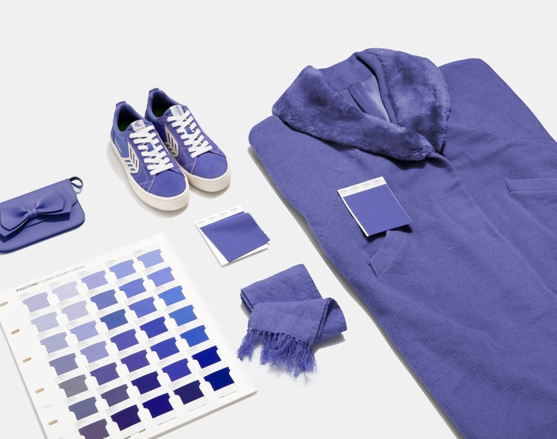
Very Peri is recommended as an accent color, photo source: fltimes.com
The selection of Very Peri color was mostly influenced by the rising popularity of metaverse, associated with the steady development of the digital art community.
Besides, according to Laurie Pressman, Pantone Color Institute Vice President, "The Color of the Year 2022 announced by Pantone reflects global culture trending, by giving voice to public search, as something that hopefully might be satisfied by this color. The creation of a new color for the first time in the history of our ‘Color of the Year’ educational program reflects the innovation and global transformation taking place. As society continues to recognize color as a critical form of communication and a way to express and influence ideas and emotions, to engage and connect, the complexity of this new shade of blue infused with purple-red highlights the expansive possibilities that lie ahead."
What about the influence of 2022 color on trends?
For over 20 years, the colors chosen by the Pantone Institute have been influencing buying decisions in industries as diverse as furniture and fashion. Besides the fact that it selects the year color based on research, Pantone works with the world's leading brands to benefit from psychology, emotion, and power in design strategies.
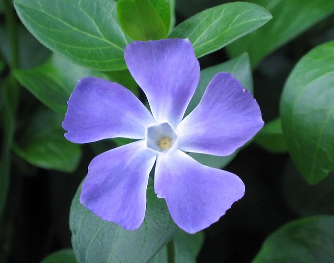
The flower that inspired the Very Peri name, photo source: gardenia.net
Very Peri: 2022 Color in interior design
If you want to integrate Very Peri into your design project, we have prepared a short guide to help you through the process.
-
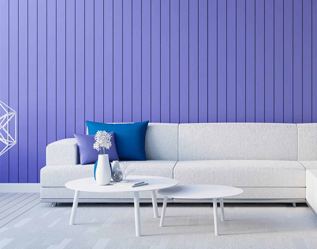
Accent wall
Probably the handiest and most often used method of incorporating the 2022 color into your design. If you find it too busy to paint all four walls of your room, then paint just one to create the needed accent. Or you can even have a blue-violet shaded wallpaper.
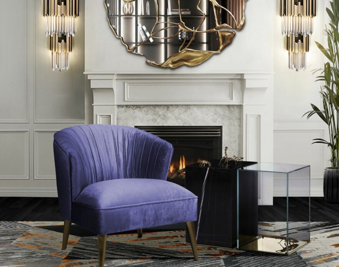
2. Furniture accent pieces
Whether you're decorating your living room or bedroom, you can integrate a Very Peri shade armchair into your interior design. Instead, you can have a Very Peri statement sofa. Even if you limit yourself to a painting or a majestic decoration element, you're going to have the desired result. Integrating even a single piece of furniture in Very Peri color will be a great benefit for decoration projects with a neutral color scheme.
If you want to include Very Peri in your design project, get inspired here, photo source: elitedaily.com
3. United color accents
In here we're talking about accessories able to be incorporated moderately into every room, for consistency. Add a Very Peri scented candle, a picture or frame, a decorative flower, cushions, and so on.
4. Combine Very Peri with shades inspired by nature
You may not know it, but the name Very Peri is derived from Periwinkle, a flower with bluish-purple hues. A shade that is a perfect match for nature-inspired shades. If you find it too daring, you can balance your Very Peri with shades of soft mauve or sallow tones like terracotta.
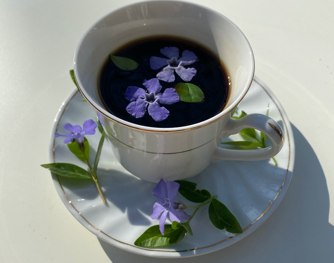
Very Peri integrates easily in your decoration projects, photo source: pexels.com
In 2021, the Pantone Institute has designated Ultimate Grey and Illuminating as the two colors of the year, independent, yet mutually supportive shades. According to Pantone's vice president, colors are a way of expression, communicating ideas and emotions, and Very Peri brings up endless opportunities.
How to integrate Very Peri as an accent color in your decoration projects, photo source: thetilesofindia.com